Love Letter to the Early Internet
The “Early Internet” here refers to the late 1990s to the early 2000s, where the Internet was no longer the exclusive domain of technologists, but still mostly limited to enthusiasts. Just about anyone could put together a website on the World Wide Web, but not everyone was into it yet.
Web Design of this period had many iconic characteristics that, for better or worse, give me warm fuzzies. At least one place has labelled this era the “Golden Age of Web Design,” which I of course agree with. However, this letter is addressed to the early 1990s pages that were just pulling themselves up out of black and white text with 16-bit graphics as well. The wave of the “Golden Age” had started by the time I showed up, but only just: I got to watch it wash across the ‘net, leaving a wake of color and style in its wake.
Let’s Get You Dressed…#
The very early web was plain black and white like this site, but the turn-of-the-millennium “early web” was not. Let’s fix that (optional) before continuing!
Backgrounds#
<body background="/img/background.gif">
	...
Did you know that instead of a white background, or a solid color, you could use a background image? Once this fact was discovered, the enthusiasts went gangbusters, slapping tiled background images on pages everywhere!
Are you ready?
Sometimes they were even animated!
Toggle Animated Background… if you dare!
Background Music#
If you loved animated GIFs and background images, you’d’ve loved background music! Pass the aux cord, the site you visited is taking control and playing something for you. BGM usually started automatically out of necessity - embeddable player technology hadn’t matured yet so sites couldn’t offer control even if they wanted to!
Nowadays, basically everyone agrees that sites making sound on their own is a nuisance. IMO, much of that is born out of the few dark years when advertisements would autoplay sounds at you. The vintage web was much more polite in its sound design: you got background music to set the mood for the site you were preparing to peruse.
Tabbed browsing didn’t make it to mainstream until much later and screen resolutions weren’t big - 1024x768 was the standard and close to the maximum you’d ever encounter - so folks were often only looking at one page at a time. With that in mind, it made a lot more sense for a webpage to decide to play a theme song for you: it could be reasonably confident that the only thing you were doing on the computer right then was related to that very page!
Many of these background tracks were MIDI files, a sort-of equivalent of vector graphics - they didn’t contain the sound data, but instructions on how to generate it. You had to have a sound font installed to play them, and depending on the font, they’d sound different! You could run the same MIDI through a piano and an electric guitar font to hear two radically different versions of the same song! In case you need it, here’s what I think is the Windows 98 default sound font: Windows 98 Sound Font / download. Modern browsers seem to still be able to figure MIDI out, though. You might need the sound font if you download the BGM and try to play it on your own machine.
Here are a couple examples from the GeoCities Gallery:
Or, maybe you’d like some BGM of your own…
Assuming Return Visitors#
Websites would often say things like
The so-and-so page has moved to …
or
Added a bunch of new stuff to the such-and-such page…
or
I’m working on the redesign, should be live soon, check back!
and sometimes even clever little widgets (usually cookie-based) that would actually say “welcome back” if you were recognized as a returning visitor!
All of these could be dismissed nowadays as bloggy phrases, trying to be approachable, but that wasn’t the case in the early web. Everyone actually believed and took for granted that the visitor reading them either has been here before and chose to came back, or that they will come back. Otherwise, being advised of recent or planned changes to the site’s organization wouldn’t be necessary! You’d just say something in the present tense, like “Such-and-such content: here.”
But no! The phraseology all took for granted that visitors would come back! It was cozy to write to your imagined, assumed returning visitors back then, and it’s a cozy memory in retrospect, too.
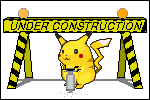
Under Construction#

Nothing was ever finished… And since sites expected people would come back, they put up “under construction” badges to let people know that things would be changing, so pardon the mess and do please come back later to see the updates!
I don’t recall ever seeing someone take down an “under construction” badge. If anything, they became a badge of honor, a sign that you were alive and kicking and building!
Every Under Construction gif from the 90s
www.textfiles.com/underconstruction (archive)
Nowadays, sites make changes all the time as part of normal operation - not an exceptional event that warrants mention. They’re constantly A/B testing and fixing and improving. There’s no hullabaloo about it, and also no end. In a way, that’s the same as before…
I reckon a difference is that changes to structure are now assumed and unremarkable, and changes to content are something to be ashamed of, almost. Did you change your post after you first published it? Why? What are you hiding? Why were you wrong? Which version does Google have in its index? You’re killing your SEO with those edits!
Anyway, this page is under construction, so please come back later to see the updates!
Finding Friends#
Google hadn’t crawled the whole internet yet. So, how did you find stuff? There were search engines, yes, but there was also a huge focus on individual websites with some kind of commonality, intentionally linking to each other.
88x31 & 468x60#
If you were webmastering on the early web, you probably know these two dimensions by heart. 88x31 was the standard size for a little button that you would create for others to use to link to your site. It was probably a .gif, because that was the format that could encode animations back then - and if the purpose was to get people to click to go to your site, a little motion went a long way! You’d usually only use a .jpg if you wanted a “high definition” image but in a reasonable filesize for the bandwidths available at the time.
These were often displayed on their own sites accompanied by a <textarea> HTML element with copy/paste-able HTML code for the button, so people could more-easily add it.
Now, it didn’t take long for folks to realize that .gifs also supported transparency so you could give up a little bit of that precious 88x31 real estate to make your button pop - here are couple examples from 2005:
And of course, an updated dogblog button from 2025:
468x60 was the standard size for a banner ad. If you were making something this big and it was actually being shown on other sites, you were hot stuff! These puppies were often animated! It wasn’t likely that someone would take one of these and choose to link back to you with it - in the days of 1024x768 displays, that 468x60 was a big chunk!

Unlike today, where ads squeeze themselves into every shape and size they can, these were kind of the big two form factors for website promotion, and so people would need to make one of each, but usually only these two!
Cliques and Fanlistings#
Those are modern words. Back in the day, you just had links - sometimes a section of one homepage, sometimes their own page. Maybe one site might host multiple link pages for different topics, if they were feeling really fancy. How did a link get on those pages? Originally, it was mostly author curation and choice - just things the webmaster thought was worth linking to. Nowadays, we’d probably call that a “linkroll.”
These were usually uni-directional links - no link-back expected from the targets. You’d stumble through to the next site and keep going on your journey until you reached a site that didn’t have any links of its own.
This developed into “If you have a cool link or site, e-mail me and I might add it” - proto-crowdsourcing!
From there, the thirst for traffic birthed a sibling idea: reciprocal “Affiliate Links.” Long before “affiliates” tooks its current revenue-sharing meaning, “Affiliates” were just other sites that you agreed to swap links with, and you’d each display them somewhere prominent. That’s what your 88x31 buttons were for!
Affiliate links often formed a more circular graph of hyperlinks - you might see the same set of Affiliates all on each other’s pages, and the odd one out would be your “exit node” into foreign waters. Congrats, you found an early network!
Nowadays, these sort of linkrolls - where they’re topical and curated to some degree - are often called “cliques, “weblistings,” or “fanlistings.” The modern incarnations usually do require link-backs, and so they’re more of a hub-and-spoke network. Once you find one site, you find your way to the directory and then you can click out from the listing to all the members.
Vibrationally, Cliques are often about the people behind the sites, Fanlistings are about a common interest, and Weblistings are about a common characteristic of the sites themselves… but not always!
- Modern Weblisting: Café Rosé Cute sites
- Modern Clique: Hopeless Romantics
- Modern Fanlisting: Wheels of Steel Fans of the black Chevy Impala from the TV Show “Supernatural”
Here’s a weblisting I’m in:

Webrings#
What if…
- It was the 1990s
- Loading webpages and executing navigation was slow and difficult
- You wanted a network of related sites
- You wanted people to be able to easily surf through them?
The Webring was the answer! It was a curated central list of sites that were related somehow, but with a specific expectation of reciprocity: More than just a backlink, you’d put a “forward” and “next” link on your page next to the name of the webring. Those would take people to the next and previous sites in the listing, forming a ring (hence the name) of related sites. Users could go directly from one related site to the next, with no middleman. Eventually, they’d get to all of them. And, if a link was broken, they could either pop back up to the main webring listing and pick a new entry point or click the “random” link that was also often present.
Webrings caught on as a concept and were fairly early operationalized into WebRing.com in 1994 - a service that made it easier for folks to run their own webrings. Yahoo bought it and killed it, but there are modern incarnations such as onionring.js alive and kicking.
TODO: Join some webrings. So, let’s try to join some…!
Aesthetic Variation#
Different pages looked different. Sites didn’t have to have a single cohesive theme. You’d find something on the homepage, click into a topic-specific section and find an entirely different design: different colors, fonts, and whole layout. This wasn’t just accepted, it was expected. I think the main reason was that sites were “shelves” where people put the various things they wanted to share, versus today a site is often “a brand” that needs to maintain consistent style throughout. I’d like to believe this was because the hearts were purer - or at least it was easier to find a pure heart’s site - but it could also have been symptomatic of hosting being so relatively hard to come by.
If you had one place and one domain and it was expensive and difficult to get another, you’d just put your different stuff in different places on that one site because it was already there!
Brands, advertisers, and marketing hadn’t matured at this point, so there was very little consequence for having “mixed messaging” across a single site. Moreover, search engines hadn’t matured yet, either, so maximizing the variety of content available within a single discovered site was welcome - where else were you going to find something to look at?
Animated GIFs#

As you’ve noticed by now, this page has graphics that move! Many of them, each doing their own thing and they didn’t wait for you to press “play!”
The internet from before the late 90s was a much more static place because the technology to create and share animations wasn’t as widespread. Graphics programs were rarer because PCs were less-powerful, and bandwidth was much lower and more-expensive. Even if you did make an awesome animation, your visitors might not be able to pull it down and see it - or they might not appreciate having to! So once people started being able to do it, they were off to the races doing it everywhere! Buttons, decorations, “look at this cool pic I found,” and yes, even banner ads blinked and vied for your attention everywhere… and we (except for the banner ads), generally loved it. The web was coming alive and it felt cool!
Feast your eyes on this bad boy:
Nowadays, “autoplay” whether it be visual or audio, is a big no-no. The major websites - YouTube, Amazon, Facebook, Twitter, Google, etc. - all have static, unmoving content. Pick your own most-visited site and take a look at it through this lens - it’s dead, isn’t it? Motionless.
Probably ultimately for the better, but there was definitely a sweet spot somewhere in-between “carnival of autoplay” and “dead tree.”
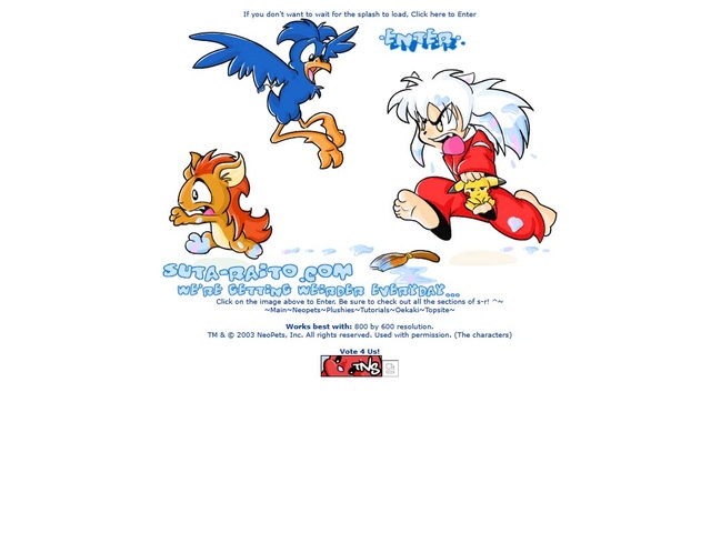
Splash Pages#
“Click here to enter”
It used to be popular to have a “splash page” with a little intro to your site, usually a big graphic, and a link to click to enter the main site. As an instance of Aesthetic Variation, these offered a chance to decorate another page with a different style. The form of “big graphic; click here to enter” offered constraints and thereby cultivated creativity.
Some splash pages were just an image with a link and maybe a tiny bit of text, like this one from 2005. No that’s not an artificially-small image; that’s a 1024x768 screenshot and how their homepage would’ve fit in it!
Others added decoration and description all over the page, growing quite tall and busy, like posters on the windows and door of a shop you might choose to enter:
Censorship Pandas#

Adopt-a-Censorship Panda
www.mabsland.com/Adoption.html (archive)
“Adopts” were popular decorations for websites. Someone would make a little character image, and others could post it on their page to “adopt” it. Why? Decorating sites was cool. Sometimes you’d name your adopted creature and make it a character of your own, sometimes not.
The Censorship Pandas were, well, to quote Miss Mab:
As I browsed through the net, I realized that there were a lot of those “adopt a dragon” or “adopt a fuzzy” things were people would draw a picture then have other people ‘adopt’ it to put it on their sites. Kinda a cutesy way of getting visitors. I had a couple once, but over time I took em down. I mean, other than saying “this is what I adopted somewhere on the net”, what point was there to them?
Then an idea hit me.
Everyone is familior with web-ratings. Those are those things on a site that say whether or not they are PG rated or for Mature people only. Course they only come in that black box styles.
So I decided… why not combine the two?
For whatever reason, the Pandas were really popular and you’d see little web-rating pandas peeking at you from the unlikeliest of places. Amazingly, their homepage, first recorded in the Wayback Machine in 2001, is still online mostly unchanged in 2025.
Free Hosting#
tripod, lycos, expage, geocities, angelfire, fortunecity
Bravenet Forms#
TODO
Guestbooks#
TODO
Analytics#
Google Analytics hadn’t been invented yet - for a good chunk of this time period, Google hadn’t even been invented yet! JavaScript support was rudimentary when a Browser even had it, so the modern “tracking pixels” couldn’t give insight to visitor behavior or page popularity. The only kind of analytics anyone could really count on were web server access logs, but… you had to have access to the web server to see them, let alone process them into metrics for humans!
The popular and accessible Free Hosting providers of the time rarely offered that! Usually you could upload .html files and some images to a directory that a shared web server would expose. Everything else about the web hosting was usually hidden from the webmasters.
The few hobbyists that were actually running webservers and figuring analytics out for themselves, also figured out how to offer rudimentary access to that information as a service…
Hit Counters#
The simplest indicator of a page’s popularity was a Hit Counter.
Someone, somewhere, who did have a bit of programming knowledge and access to a server would whip up a script that would
- increment a count by 1 when viewed
- output image data with the count on it
Every time the page loaded, the counter went up by one - now you could know if people were visiting your site! More sophisticated Hit Counters would attempt to distinguish “Visits” (usually by counting unique IP addresses) from simple page loads, and keep daily and/or weekly tallies. These gave early webmasters a rough general sense of if their site was getting traffic.
Hit counters, as with so many early web accoutrements, were design elements in and of themselves. Lots of services offered a variety of styles and customization options, some even letting you upload your own images and fonts!
Nowadays, proper analytics from server access logs or JavaScript tracking is the norm, and offers much more detailed and accurate insight into visitor behavior than a simple count.
The hit counter above is actually a working example from a site that still offers this service!
WebsiteOut Free Web Counter
www.websiteout.net/counter.php
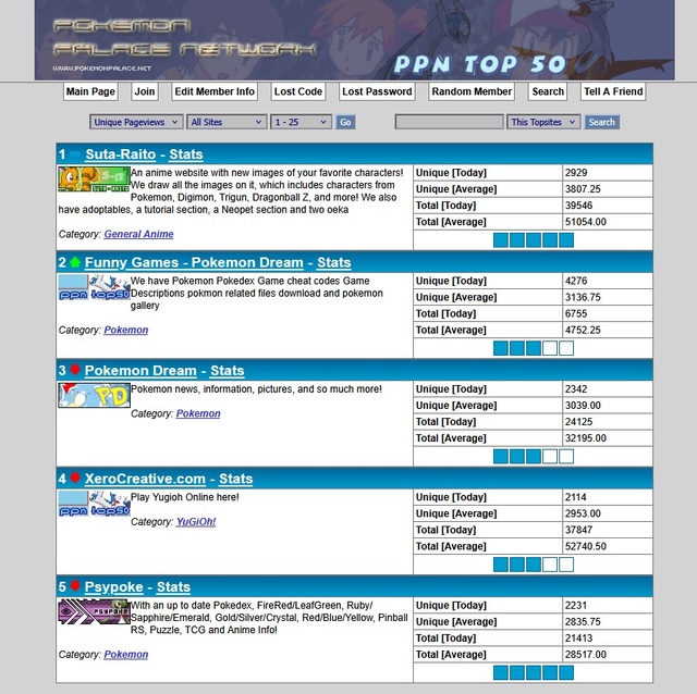
Topsite Lists#
So you’ve found a site you like, and through its links and webrings, you’ve found some others. Which ones are good though? You’ll have to read ‘em all!
Unless… Combining a webring and a hit counter gives you a “topsite list” - a list of (usually) related sites, but ranked by popularity.
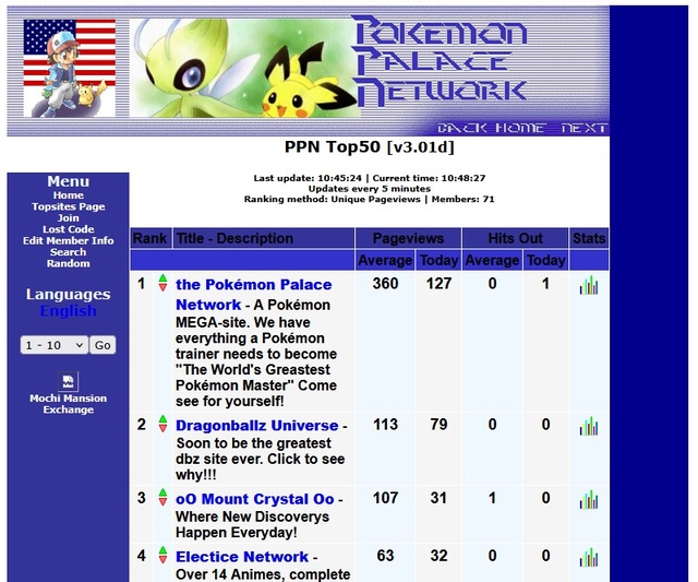
Before search engines could essentially generate such a list on-demand for you for any category or query you could give them, this was an early way to find “the best” sites in a category! Members would place an 88x31 button linking to the topisite list on their page and it would render with each member site’s actual rank on them, hit counter-style!
Many of the topsites I was in - and ran! - used the aardvark topsites php script. By the 2000s, PHP-enabled web hosting was more available, and it was relatively easy for anyone to drop a folder of scripts into a directory and run their own topsite list! With administration panels to simplify member management and built-in analytics (and prestige), these were an attractive alternative to webrings.
Interactivity for its Own Sake#
So many people were exploring the new medium of the World Wide Web, looking to see cool things. Webpages that could figure out how to do “a cool thing” would put it on their page… and the bar was, lovingly, low! There were all sorts of interactive gimmicks that were usually ephemeral and ultimately pointless… except for that they interactively did something, and the web before this time didn’t do things.
Jukeboxes#
The idea of digital music was a big deal and very cool back then! Hopefully you chose to play the background music on this page, so I’ll spare you an actual Jukebox. Regardless, an in-page Jukebox - for reasons laid out in the background music section - wouldn’t be that big a deal today. You can just go play a music video on YouTube or something!
But back then, Jukeboxes were an evolution of politeness beyond background music. Maybe you didn’t want to hear the exact same song looping forever, automatically… but pages still wanted to offer the option of mood music! You might find a little <form> dropdown or a fancy Javascript widget, or sometimes even a Java Applet labelled “Jukebox” with a selection of songs that you could choose to play while you read the page. These were usually still MIDI files, but .mp3 started to come onto the scene by the mid 2000s and they were just small enough and bandwidth was just getting wide enough to make “real” songs (ripped from CDs, of course) playable in a browser. In my opinion, the biggest deal about .mp3 jukeboxes was that you could finally have lyrics in your tracks - something MIDIs didn’t offer.
You kind-of had to stick to instrumental tracks for background music if you were going to autoplay it while someone was reading your page. But a Jukebox that the visitor controlled? Well, they could put a track with lyrics on when they wanted!
Here’s a modern site with a Jukebox, if you’re curious! Winbows also has one… it’s a WinAmp!
See It (Again?)#
There is a whole subculture of people living and breathing the turn-of-the-millenium web design aesthetic in newly-minted sites. These sites are others’ living love letters to the era. In addition to archiving sites of that era, some folks have taken it a step further and built search engines that only index sites that are literally or vibrationally from that era.
You can go Browse the Vintage, Early Internet to see them!